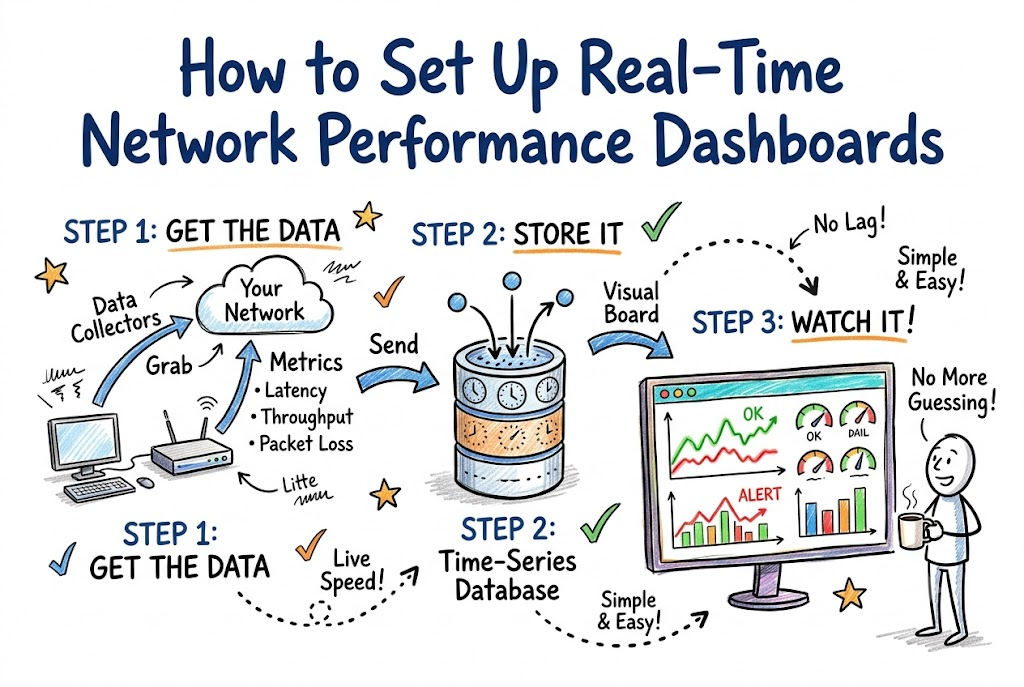
Imagine you drive a fast car on a long trip. You need a dashboard to check your speed and gas.
Computer networks need a dashboard too. A network dashboard is a screen with dials, bars, and charts. It shows if your internet runs fast or slow. You can learn how to build awesome tools at Noopsschool.
When wires get clogged, apps stop working. A good screen helps you spot trouble before users get mad. We will teach you how to set up this helpful tool today.
What Is a Network Dashboard?
A network dashboard acts like a health monitor in a clinic. It listens to all your routers and servers.
Next, it turns boring numbers into colorful visual graphs. Green lines mean traffic flows smoothly. Red lines warn you about bad traffic jams.
Because of these charts, engineers do not have to guess. They look at one main screen to see the whole truth.
The Main Parts of Network Tracking
Every good dashboard needs three main working parts.
First, you need small helper tools called data collectors. These little tools sit on your routers. They count every data packet that flies past.
Second, you need a big digital storage box called a time-series database. This special box saves numbers in order of time. It remembers your speeds from ten seconds ago.
Third, you need a picture screen called a visual board. This board reads the saved numbers. Then, it draws pretty bars and lines for your eyes.
Key Operational Concepts You Must Know
You must track three vital metrics on your new screen.
The first metric is packet delay, which people call latency. It measures the round-trip travel time of your data. High delay means games and videos will freeze.
The second metric is data speed, which people call throughput. This tells you how much data moves every single second.
The third metric is packet loss. Routers drop data packets when memory queues get too full. High loss ruins phone calls and web pages.
| Metric | What It Means | Ideal Goal |
|---|---|---|
| Latency | Wait time for a reply | Very low number |
| Throughput | Volume of data moved | High steady line |
| Packet Loss | Dropped pieces of data | Zero percent |
Tracking Jitter and Error Rates
Your screen should also watch jitter. Jitter means your packet wait times bounce up and down. Bumpy timing makes voices on voice calls crack and skip.
Also, track your hardware error rates. Broken wires often cause silent bit errors. A sudden spike in errors means a physical wire is loose.
Platform Implementation vs. Culture — What’s the Real Difference?
A good dashboard requires both great software tools and great human habits.
The tool side is the platform. This means installing collector software, cloud databases, and bright screen panels. These tools collect and draw the numbers automatically.
The human side is the team culture. Culture means how your team responds to warning signs. A fancy screen is useless if workers ignore red flashing lights.
Roles and Daily Habits
- Network Helpers
- Platform: Set up collectors on all edge switches and cloud gateways.
- Culture: Check the main screen with morning coffee every day.
- Code Writers
- Platform: Send app speed numbers directly into the time database.
- Culture: Fix code immediately when latency bars jump up.
- Team Bosses
- Platform: Buy large TV monitors for the main office wall.
- Culture: Praise workers who catch traffic problems early.
Real-World Use Cases of Modern Operations
Let us see how real teams use these screens to save the day.
First, look at a big online store during holiday sales. Millions of shoppers tap buy buttons at the same moment. The network dashboard shows server pipelines filling up rapidly.
Because operators see this spike, they quickly turn on extra cloud servers. The store stays online without a single crash. Customers buy their gifts with zero delays.
Next, consider a busy online gaming company. Thousands of players fight in one big virtual arena. If server lag spikes, players get angry and leave.
The game team watches packet delay across every global city. If one route turns yellow, they shift players to a faster pipe. Games stay super smooth and responsive.
Finally, think about hospital networks. Nurses use smart pads to check patient heart monitors across local Wi-Fi.
A hospital dashboard watches Wi-Fi signals in every single hallway. If an antenna drops offline, engineers fix it right away. This keeps critical patient monitors running safely.
Common Mistakes in Operations Engineering
Many engineers make silly mistakes when they build their first dashboard.
The biggest mistake is adding way too many charts to one screen. People call this visual mess dashboard clutter. If a screen has sixty graphs, nobody knows where to look.
Keep your main screen simple and clean. Show only the top four or five most important charts. Move deep technical details to a second page.
Another bad mistake is setting noisy alarm buzzers. If alarms go off every five minutes for tiny things, people turn off the sound. Engineers call this bad habit alert fatigue.
Only ring loud bells when real users feel pain. Save soft notifications for small issues.
Lastly, teams forget to test their tracking collectors. If a collector tool crashes, your dashboard shows flat lines. You might think everything is great when the network is actually broken!
How to Become an Operations Expert — Career Roadmap
You can turn network monitoring into an awesome career path.
Start by setting up simple tools on your home computer. You can install free open-source monitoring software on an old laptop. Track your home Wi-Fi speeds during family movie nights.
Next, learn how to build automated setup scripts. You can write small programs to launch dashboards automatically across cloud machines. This saves hours of boring manual setup work.
| Step | Core Goal | Fun Practice Task |
|---|---|---|
| Level 1 | Learn metrics | Graph home router ping times on a screen |
| Level 2 | Automate tools | Write a script to install a visual dashboard |
| Level 3 | Master scale | Track global servers across different clouds |
After that, study how big companies handle massive data streams. Learn how to process millions of speed checks every second. You will become an expert who keeps the whole internet running!
FAQ Section
- What is the best metric to put on my main screen?Round-trip packet latency is usually the best metric to watch first.It shows user wait time faster than any other single number.
- Can a dashboard slow down my computer network?Yes, but only if you check speeds way too often.Checking devices every ten seconds keeps your network safe and happy.
- What is the difference between an alert and a metric?A metric is simply a live number, like current speed.An alert is an alarm that rings when that number crosses a bad line.
- Do I need expensive screens to run a dashboard?No, you can view your dashboard on any normal web browser.Most engineers check their charts right on their everyday laptops.
- Why did my chart go totally flat?A flat line usually means your data collector tool stopped talking.Check your server connection to make sure numbers are still flowing.
Final Summary
A real-time network dashboard is your eyes and ears inside complex digital wires. It tracks latency, throughput, and packet loss so you never fly blind. Setting up clean collectors and clear charts helps you spot hidden traffic jams right away.
Remember to keep your main screen simple and easy to scan. Build a strong team culture where engineers watch metrics and fix issues early. When you watch your numbers closely, your networks stay fast, stable, and ready for users.